The article covers the following topics:
- Add New Field
- Edit Field
- Delete Fields
- Rearranging Fields
- Copy a Field (Duplicate Field)
- Enable/Disable Fields
- Reset to Default Settings
- Overriding a Default Field
Installing Checkout Field Editor lets add custom fields apart from the default ones. You can choose from over 24+ field types to your checkout form:
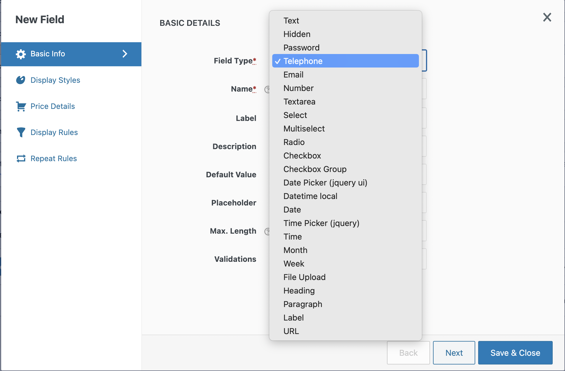
- Text
- Hidden
- Password
- Telephone
- Number
- Textarea
- Select
- Multi-Select
- Radio
- Checkbox
- Checkbox Group
- Date Picker
- Time Picker
- File Upload
- Heading
- Label
- Datetime local
- Date
- Month
- Time
- Week
- URL
- Paragraph
Add new field
To add a field:
- Navigate to the WooCommerce → Checkout Form → Checkout Fields page.
- Click on the Add field button.
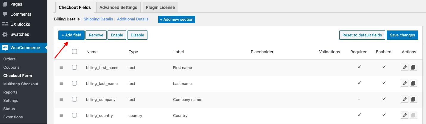
- Enter a Name, Field Type, Label, and other details of your field.
- Set display rules from the Display Rules tab if required.
- Set display styles from the Display styles tab if required.
- Set price details from the Price details tab if required.
- Set repeat rules from the Repeat Rules tab if required.
- Click on the Save Field button.
All these tabs are explained below.
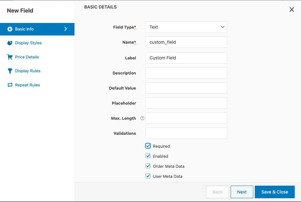
Basic Info
This tab contains fields to capture all the basic details of the checkout field. All the properties available in the General Properties tab are listed below. Depending on the field type selected, the properties of the field may change.
| Field Type |
The type for the field. It could be text, password, text area, select, checkbox, radio, paragraph, URL, etc. |
| Name | Unique name for the field. No two fields can have the same name. |
| Label | The display label for the field. |
| Description | Description for the field. The description is displayed below the field label. |
| Default Value | You can assign a default value for the field. This value will be shown as the default value when the checkout form is loaded. |
| Placeholder | The placeholder property is a short hint (a sample value or a short description of the expected format) that describes the expected value of an input field. For example, for an email field, the expected format name@example.com can be displayed. The short hint is displayed in the input field before the user enters a value. |
| Max. Length |
The max length property specifies the maximum number of characters allowed in the input field. |
| Validations |
Choose validators that should be applied to the input field. Email, Phone, and Number are supported out-of-the-box. You can define your own validation rules in the Advanced Settings section. Any validation rule defined in the Advanced Settings section will appear in the select box. To learn more about custom validators and their configuration, see Custom Validators. |
| Required |
If checked, the field will be set as a mandatory field. |
| Enabled |
Uncheck this checkbox to disable this field. |
| Order Meta Data |
This property can be used to save your custom value as part of order data so that this field value will be specific to each order. (For example, Delivery Date which is specific for each purchase.) Order fields will be saved in wp_postmeta table as Order metadata. To create Order fields you must select the checkbox 'Order Meta Data'. |
| User Meta Data |
This property can be used to save your custom field value as part of user data, so that the custom field will be available in the user profile page and the user can edit the value from there. The user metadata is the information directly related to the user and will be the same for every order to a probability of 90%. Data like date of birth, email, billing and shipping addresses, etc. belong to this category. User fields will be saved in wp_usermeta table as user metadata. Custom user field values can be updated from the user profile page. To create User fields you must select the checkbox ‘User Meta Data’.
The custom fields of Billing and Shipping will be displayed at My Account page → Addresses → Corresponding Address(Billing or Shipping).
The custom fields created in the Additional info section and in the custom sections will be displayed at the My Account → Account details tab. |
Display Styles
| Wrapper Class | A comma-separated list of CSS classes will be added to the container that wraps the input field and the label. |
| Input Class | A comma-separated list of CSS classes will be added to the input element. |
| Label Class | A comma-separated list of CSS classes will be added to the label tag. |
|
Display in Admin Mails |
By selecting this property, display the field and value in all WooCommerce emails sent to Admins. |
|
Display in Customer Emails |
If this property is selected, the field and its value will be displayed in the Order Confirmation email (customer copy) and Thank You mail. |
|
Display in Order Detail Pages |
This property can be used to display your custom field and its value on the Order Details page (for both Admin & Customer views). |
|
Display in Thank You Page |
Check this option, and the field details will be displayed in your Thank You page. |
Price Details
| Price |
Add an additional price to the order total based on the field value. To learn more about price fields and their configuration, see Price Fields. |
| Price Type | |
| Taxable and Tax Class |
Properties specific to the field types - Text and Telephone
|
Input Masking |
|
|
Input for these fields can be predefined to a set format in - alphabets/ numeric/ alphanumerical/ special character |
|
|
a |
alphabetic |
|
9 |
numeric. Example : (99) 99999-9999 allow input like (12) 12345-1234. |
|
@,%,!,$ and ^. |
Special characters can be added which ever is required |
|
* |
alphanumeric |
|
Dynamic |
The input can be in any format as customer feeds in Eg: a{1,3}-9{1,3} this will have a pattern of 3 letters followed by a special character and 3 digits 3 digits. Eg: abc-123. |
Properties specific to the field types Select, Multiselect, Radio, and Checkbox Group
| Options | |
| - Option Value | Option key |
| - Option Text | Display label for the option. |
| - Price | The extra price added for the option. |
| - Price Type | The type of price added to the option. |
Properties specific to the field type Select and Multiselect
|
Disable "Enhanced Select (Select2)" for select field |
Select2 supports advanced styling and searching options of remote data sets, and infinite scrolling of results. By enabling this option the enhanced select features will be disabled. |
| Maximum Selections | The maximum number of options that can be selected from the multi-select field |
Properties specific to the field types Date, Time, Month, Week, Datetime local
|
Default Date/Time/Month/ Week/Datetime local |
You can assign a default date/time/month/week/datetime local for the field. This will be shown as the default set date when the checkout form is loaded. |
|
Min. Date/Time/Month/ Week/Datetime local |
The calendar will only show dates starting from the date/time/month/week/datetime local set in this field. Enter the value as per suggested format in the tooltip. |
|
Max Date/Time/Month/ Week/Datetime local |
The calendar will show dates upto the date/time/month/week/datetime local set in the field here. Enter the value as per suggested format in the tooltip. |
Properties specific to the field type Datepicker
| Date Format |
Define the date format accepted for this field. The default format is dd/mm/yy. You can edit this format and rewrite it according to your requirements. These are the other general time formats you can use:
|
| Default Date | Set default date to be displayed. Specify the date in the format specified in the Date Format property. You may also specify the number of days to be offset from today (e.g. +7) or a string of values and periods ('y' for years, 'm' for months, 'w' for weeks, 'd' for days, e.g. '+1m +7d'), or leave empty if you don’t want to set a minimum limit. |
| Min. Date | The date picker calendar will only show dates starting from the date set in this field. Specify the date in the format yyyy-mm-dd. You may also specify the number of days to be offset from today (e.g. -7) or a string of values and periods ('y' for years, 'm' for months, 'w' for weeks, 'd' for days, e.g. '-1m -7d'), or leave empty for today. |
| Max. Date | The calendar will only show dates up to the date set in this field. Specify the date in the format yyyy-mm-dd. You may also specify the number of days from today (e.g. +7) or a string of values and periods ('y' for years, 'm' for months, 'w' for weeks, 'd' for days, e.g. '+1m +7d'), or leave empty if you don’t want to set a maximum limit. |
| Year Range |
This defines the range of years displayed in the year drop-down of the date picker calendar. The format is “from year: to year”. You can set the range in different ways as explained below:
|
| Number Of Months | The number of months to show at once on the date picker calendar. |
| Disabled Days | Select the days of the week that need to be disabled on the calendar. For example, you may want to disable Saturdays and Sundays on the calendar. |
| Disabled Dates | Enter dates that need to be disabled on the calendar in yyyy-mm-dd format separated by commas for multiple dates. This is useful if you want to disable specific days such as holidays. Ensure the dates are provided in the correct format. If you want to disable 17th January 2017 and 23rd March 2017 in the date picker you can fill this field with the value 2017-01-17,2017-03-23. |
Properties specific to the field type Timepicker
| Linked Date | To link the Timepicker field to the Date Picker field, enter the field name of the date picker field in the Linked Date field. The time picker will display the time slots according to the chosen date of the linked Date Picker. If a day less than the current date is picked from the Date Picker, none of the time slots will be active to choose from. Similarly, while a day after the current date is picked from the Date Picker, all the time slots will be active. |
| Min. Time | The starting time in the list. ex: 9:00 AM. |
| Max. Time | The end time available in the list. ex: 7:00 PM. |
| Start Time | Minimum time needed to choose the next time slot. For example, if you require a minimum 2 hour and 30 minutes to prepare, pack & deliver the order placed by your customers, then you can set the Start Time as 2h 30m so the customer will only be able to select a time which is after 2h 30m from now. |
| Time Step | The interval which splits the time between the starting and ending time. In minutes, ex: 30. |
| Time Format | Choose between a 12 hour or 24 hours format. |
|
Disable time slot |
Choose any number of time slots that need disabled. Multiple entries must be separated with commas. Eg: 12:30-14:00,18:00-20:00 |
Properties specific to the field type File Upload
| Maxsize (in MB) | The maximum size for the file that can be uploaded. |
| Accepted File Types | Extensions/formats for the file types that can be uploaded. Multiple formats can be inputted separated by commas. |
Properties specific to the field types Heading, Label and Paragraph
| Title | The display text (content) for the title tag. |
| Title Type | The type of title element. Ex. H1, H2 etc. |
| Title Color | The colour of the title text. |
| Title Class | A comma-separated list of CSS classes for the title tag. |
| Subtitle | The display text (content) for the subtitle tag. |
| Subtitle Type | The type of subtitle element. Ex. H1, H2 etc. |
| Subtitle Color | The colour of the subtitle text. |
| Subtitle Class | A comma-separated list of CSS classes for the subtitle tag. |
Display Rules
Set display condition from this tab. Read the article Display Rules to know more about display rules and their configuration.
Repeat Rules
Set repeat rules from this tab. Read the article Repeat Rules to know more about repeat rules and their configuration.
Edit Field
You can change the properties of any field including default fields.
To edit a field:
- Navigate to the WooCommerce → Checkout Form → Checkout Fields page.
- Click on the pencil icon near the field you want to edit.
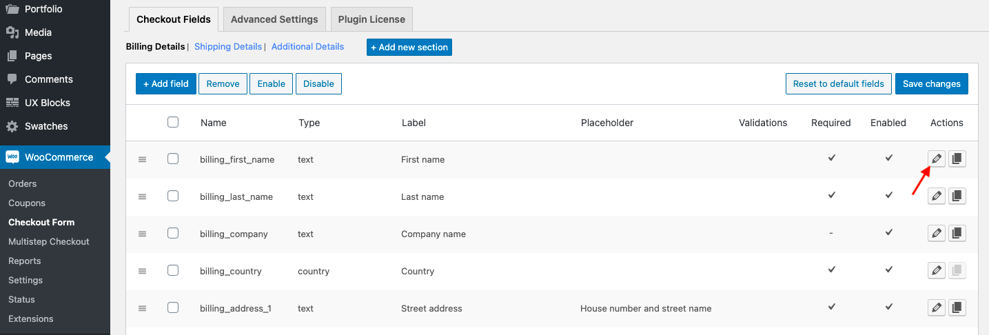
- A popup form will be displayed, you can edit any field property from this form.
- Once done with the edit, click on the Save button to save the changes.
Delete Fields
Once a field is deleted it cannot be restored.
To delete a field:
- Navigate to the WooCommerce → Checkout Form → Checkout Fields page.
- Select the fields you want to delete using the check-boxes on the left side of each field.
- Click on the Remove button from the action bar.
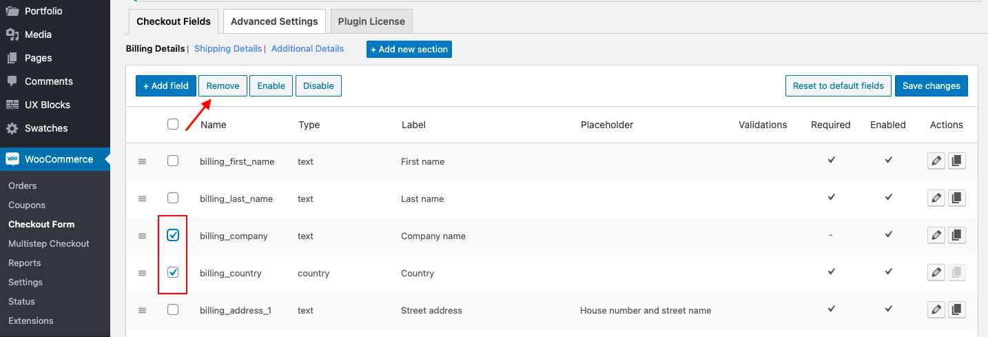
- The deleted fields will be highlighted with a red color background.
- Click on the Save changes button to confirm the delete.

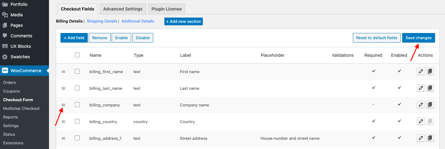
Rearranging Fields
To rearrange fields:
- Navigate to the WooCommerce → Checkout Form → Checkout Fields page.
- Move the field up or down using the move handle at the leftmost side of each field.
- Once fields are rearranged, click on the Save changes button to save the changes.
Copy a field (Duplicate field)
This option provides you with an easy way to create a new field by duplicating an existing field. This is helpful when you want to create a new field that is almost similar to an existing one.
To duplicate a field:
- Navigate to the WooCommerce → Checkout Form → Checkout Fields page.
- Click on the copy icon near the field you want to duplicate.

- A popup to create a new field will appear with all the property except the field name, filled the same as that of the duplicated field.
- Enter the new field name, then click on the Save Field button to save the changes.
Enable/Disable Fields
To Enable or Disable field(s) → Select field(s) using the check-boxes at the left side of each field, then click on 'Enable' or 'Disable' button. The selected fields will be marked as disabled and shown in a grey background color.
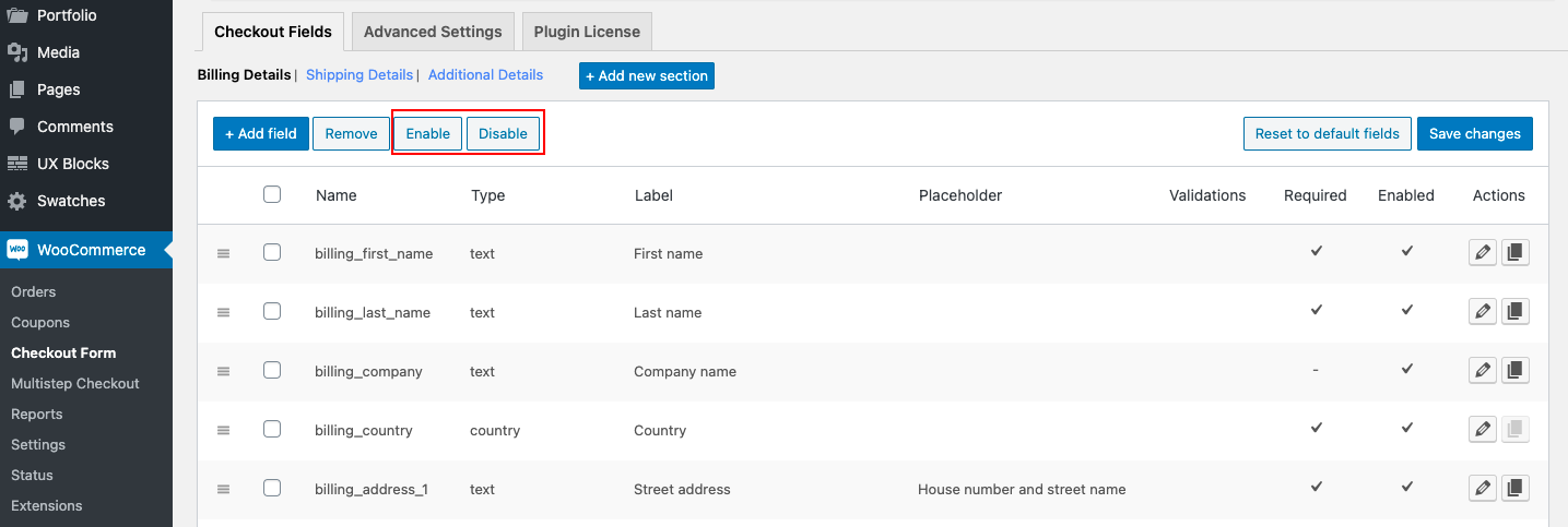
Finally, click on the 'Save Changes' button to actually enable/disable selected fields.
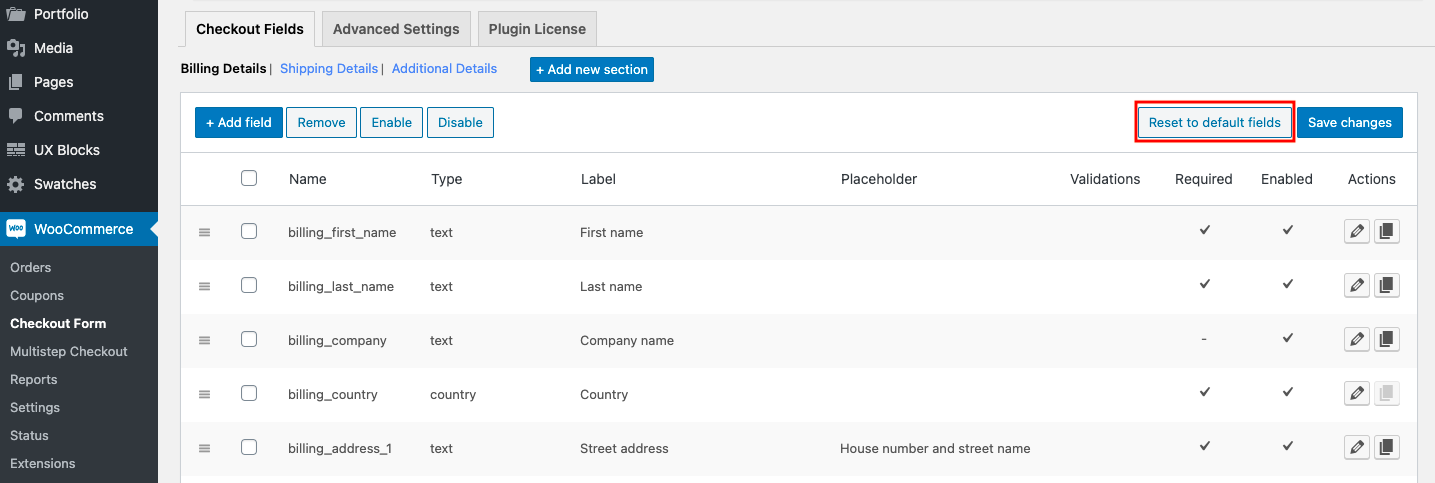
Reset to Default Settings
To revert all changes, click on 'Reset to default fields' button. Then all your changes will be removed and reset to the WooCommerce default fields set.
Overriding a Default Field
When you create a new field with the field name of a default field, the existing field gets replaced by the custom field. All properties of the default field will also get replaced with new properties assigned.
Comments
0 comments
Please sign in to leave a comment.